In the fast-paced digital world, capturing your website visitors’ attention is just the first step — converting them into loyal customers is where the real challenge lies. A powerful Call to Action (CTA) can be the difference between a casual browser and a committed buyer. Whether you’re running an ecommerce store, a blog, or a service-based website, optimizing your CTAs is essential to maximizing your conversion rates and driving business growth. In this ultimate guide to Call to Action optimization, we’ll walk you through proven strategies, design tips, and psychological triggers that will help you craft compelling CTAs that inspire action. Get ready to transform your website into a conversion powerhouse and boost your results today!
1. Understanding the Importance of CTAs in Website Conversion
A Call to Action (CTA) is one of the most critical elements on any website when it comes to driving user engagement and boosting conversions. Essentially, a CTA is a prompt that encourages visitors to take a specific action—whether it’s signing up for a newsletter, making a purchase, downloading a resource, or contacting your team. Without clear and compelling CTAs, even the most beautifully designed website can fall short in converting visitors into customers or leads. CTAs serve as the guiding hand that directs users through your conversion funnel, reducing friction and making it easy for them to know what steps to take next. Understanding their importance means recognizing that every word, color, placement, and design choice associated with your CTAs can dramatically impact user behavior and, ultimately, your bottom line. Optimizing CTAs is not just about aesthetics; it’s about crafting a seamless user experience that motivates action and drives measurable results.
2. Crafting Clear and Compelling CTA Copy
Crafting clear and compelling call-to-action (CTA) copy is essential to driving your website visitors toward taking the desired action, whether it’s making a purchase, signing up for a newsletter, or downloading a resource. The key to effective CTA copy lies in its clarity and directness—your visitors should instantly understand what you want them to do and why they should do it. Use strong, action-oriented verbs like “Download,” “Subscribe,” “Get Started,” or “Claim Your Offer” to create a sense of urgency and motivation. Additionally, make your CTA benefit-driven by highlighting what the user will gain, such as “Get Your Free E-book” or “Save 20% Today.” Avoid vague phrases like “Click Here” or “Submit” that don’t communicate the value or next step clearly. Keep your copy concise but impactful, focusing on a single, specific action to prevent confusion. Finally, consider your audience’s tone and preferences—whether formal, friendly, or playful—and align your CTA language accordingly to build trust and resonate with users. By honing your CTA copy with these principles, you’ll significantly increase the likelihood of turning visitors into engaged customers.
3. Designing Visually Effective CTAs
Designing visually effective Calls to Action (CTAs) is crucial for capturing your visitors’ attention and driving them to take the desired action. The first step is to make your CTA stand out on the page by using contrasting colors that draw the eye without clashing with your overall website design. Bold, vibrant hues like bright orange, red, or green often work well because they create an immediate visual focal point. Additionally, the size and shape of your CTA button should be prominent but not overwhelming; it needs to be large enough to click easily on both desktop and mobile devices, with rounded corners often perceived as more inviting.
The text inside your CTA is equally important — it should be clear, concise, and action-oriented. Use strong, persuasive verbs such as “Download,” “Subscribe,” or “Get Started” to clearly communicate what happens next. Pair the text with a readable font that complements your site’s typography and ensures accessibility for all users. Incorporating subtle visual cues — like arrows or icons — next to the text can also help guide users toward clicking.
Lastly, pay attention to the surrounding whitespace. Giving your CTA ample space allows it to breathe and reduces distractions, making it easier for visitors to focus on the action you want them to take. By thoughtfully combining color, size, text, and placement, you can design CTAs that not only look great but also significantly boost your website conversions.
4. Utilizing Psychological Triggers to Enhance CTA Performance
One of the most effective ways to enhance your call to action (CTA) performance is by tapping into powerful psychological triggers that influence human behavior. Understanding these triggers allows you to craft CTAs that not only grab attention but also motivate visitors to take immediate action. For instance, the principle of scarcity—highlighting limited time offers or limited availability—creates a sense of urgency that compels users to act quickly before they miss out. Similarly, leveraging social proof by showcasing testimonials, user counts, or endorsements can build trust and reassure potential customers that others have benefited from your product or service. Another key trigger is the use of clear and direct language that appeals to the user’s emotions and desires, such as focusing on how your offering can solve a problem or improve their life. Additionally, incorporating action-oriented verbs like “Get,” “Discover,” or “Join” encourages users to engage actively. By strategically combining these psychological cues in your CTA design and copy, you can significantly boost click-through rates and drive higher conversions on your website.

5. A/B Testing and Analyzing CTA Effectiveness
A/B testing is a powerful strategy for optimizing your call to action (CTA) and significantly boosting your website conversions. By creating two or more variations of your CTA—differing in elements such as wording, color, size, placement, or design—you can test which version resonates best with your audience. The process involves splitting your website traffic between these variations and monitoring key performance indicators like click-through rates, conversion rates, or engagement levels. This data-driven approach removes guesswork, allowing you to make informed decisions based on real user behavior.
Once the test is underway, it’s essential to analyze the results carefully. Look beyond just the highest click rate; consider how each CTA version influences user actions further down the conversion funnel. Tools like Google Analytics, Optimizely, or VWO can help track these metrics seamlessly. Remember, effective CTA optimization is an ongoing process—regularly running A/B tests and analyzing their outcomes ensures your calls to action stay relevant and compelling, ultimately driving more conversions and enhancing the overall user experience on your website.
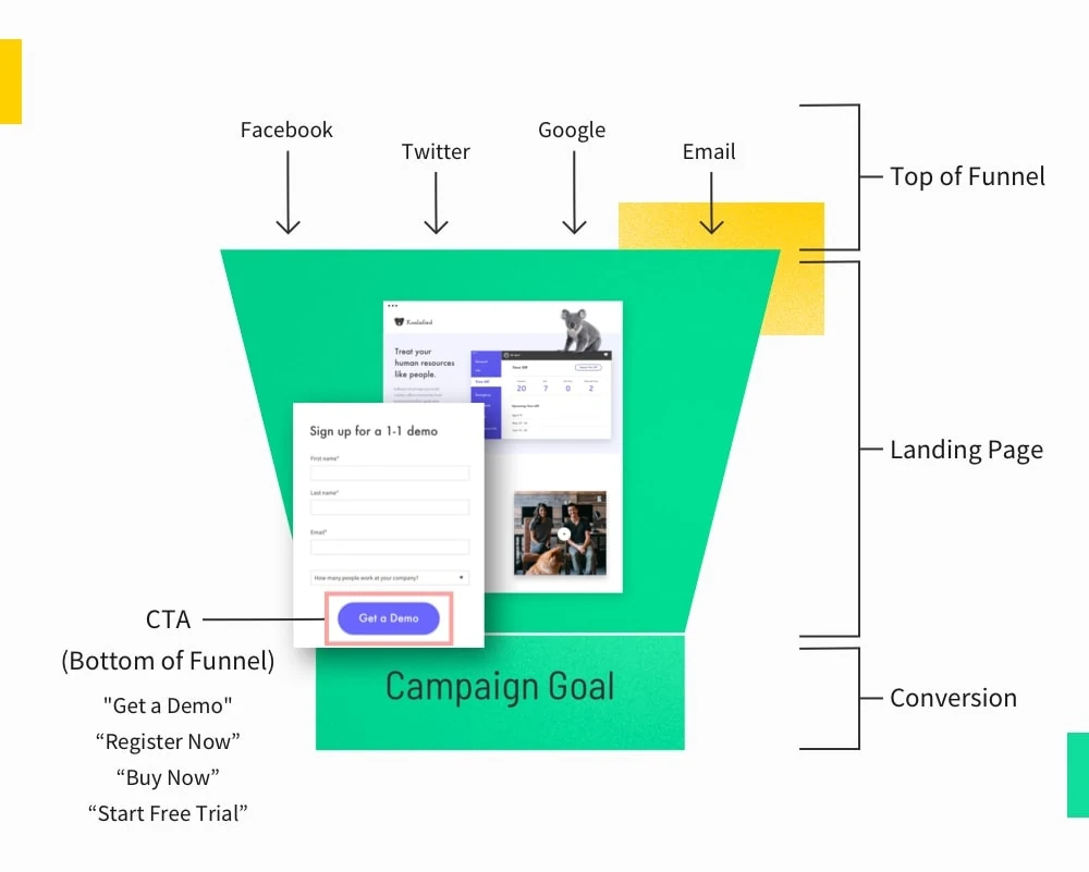
6. Best Practices for Placing CTAs Across Your Website
When it comes to maximizing the effectiveness of your call-to-action (CTA) buttons, strategic placement across your website plays a crucial role in driving conversions. The key is to position CTAs where they naturally align with your visitors’ browsing behavior and decision-making process. Start by placing a prominent CTA above the fold on your homepage and landing pages, ensuring it’s immediately visible without requiring any scrolling. This captures attention early and invites users to take action right away. Additionally, integrate CTAs at the end of blog posts or informational pages where readers are already engaged and more likely to respond. Don’t overlook the power of including CTAs within your website’s navigation menu or sticky headers, keeping them accessible throughout the user journey. It’s also beneficial to use multiple, contextually relevant CTAs on longer pages—such as a softer “Learn More” CTA mid-page and a stronger “Buy Now” or “Sign Up” CTA toward the end. Always ensure your CTAs stand out visually with contrasting colors, clear and concise wording, and enough whitespace to avoid clutter. By thoughtfully placing CTAs in these key website areas, you can guide visitors seamlessly toward conversion and significantly boost your overall engagement and sales.
7. Personalizing CTAs for Different Audiences
One of the most effective strategies to boost your website conversions is personalizing your calls to action (CTAs) for different audiences. Rather than using a generic, one-size-fits-all approach, tailoring your CTAs based on user behavior, demographics, and preferences can significantly increase engagement. For example, first-time visitors might respond better to a welcoming CTA like “Explore Our Features,” while returning customers might be more inclined to click on “Unlock Your Exclusive Discount.” Segmenting your audience allows you to craft messages that resonate with their unique needs and motivations, making your CTAs feel more relevant and compelling. Additionally, consider leveraging dynamic content tools that automatically adjust CTA text, design, and placement in real-time based on user data. By personalizing CTAs in this way, you not only create a more user-centric experience but also drive higher click-through rates and ultimately, more conversions.

8. Common CTA Mistakes to Avoid (and How to Fix Them)
When it comes to crafting effective calls to action (CTAs), even small mistakes can significantly impact your website’s conversion rates. One common error is using vague or generic language such as “Click Here” or “Submit.” These phrases don’t convey a clear benefit or create a sense of urgency, leaving visitors unsure about what to expect. To fix this, use action-oriented and specific language that highlights the value, like “Get Your Free Ebook” or “Start Your 30-Day Trial.” Another frequent mistake is placing CTAs in hard-to-find locations or overcrowding a page with too many competing buttons, which can overwhelm users and dilute their focus. To optimize, position your CTA prominently—above the fold or at key decision points—and keep the page clean with a single, standout CTA. Additionally, neglecting to optimize CTAs for mobile users can hurt conversions, as buttons that are too small or poorly spaced are difficult to tap on mobile devices. Ensure your CTAs are easily clickable on all screen sizes by using responsive design and adequately sized buttons. Finally, forgetting to test different CTA designs, colors, and copy means missing out on valuable insights. Regular A/B testing allows you to identify which CTAs resonate best with your audience and continuously improve your click-through rates. By avoiding these common pitfalls and implementing simple fixes, you’ll create compelling CTAs that drive more visitors to take action and boost your website conversions.
If you found this article helpful and need help with your website conversion, contact us for a FREE CRO Audit