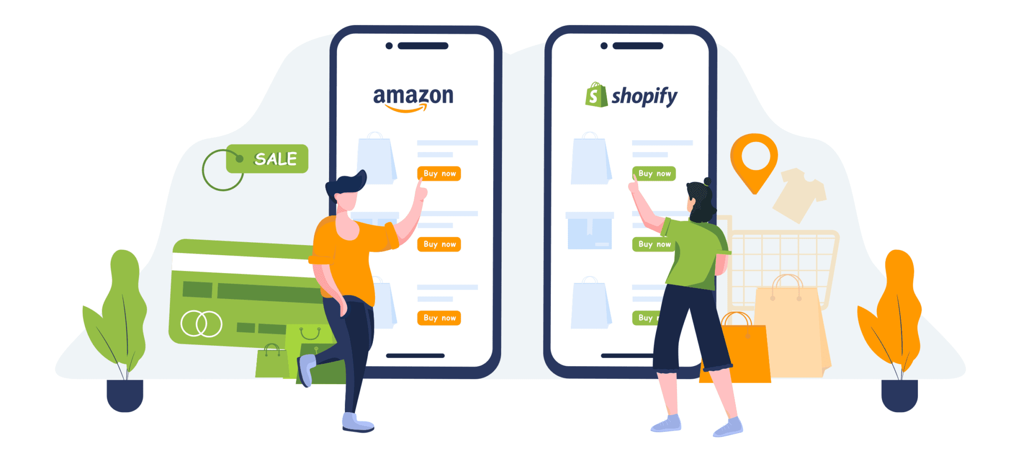
In today’s fast-paced digital world, mobile ecommerce has become a dominant force, with more consumers shopping on their smartphones than ever before. However, capturing these mobile shoppers and turning casual browsers into loyal customers can be a complex challenge. Unlocking success in mobile ecommerce requires more than just having a responsive website; it demands strategic optimization tailored to the unique behaviors and preferences of mobile users. In this comprehensive guide, we’ll explore proven strategies designed to boost your mobile ecommerce conversions, enhance user experience, and ultimately drive higher sales. Whether you’re a seasoned online retailer or just starting out, these insights will help you create a seamless, engaging mobile shopping journey that keeps customers coming back for more.
1. Understanding Mobile Shopper Behavior
Understanding Mobile Shopper Behavior is crucial for optimizing your mobile ecommerce conversions. Mobile shoppers interact with your website differently than desktop users, often browsing on-the-go and expecting quick, seamless experiences. They tend to have shorter attention spans, making it essential to capture their interest immediately with clear navigation, fast loading times, and concise content. Additionally, many mobile users prefer simplified checkout processes and multiple payment options to reduce friction and prevent cart abandonment. By analyzing common behaviors such as tapping patterns, scroll depth, and time spent on pages, you can tailor your mobile ecommerce site to better meet the needs and preferences of your audience. Ultimately, gaining insight into how mobile shoppers browse, decide, and purchase will empower you to create a user-friendly, efficient mobile shopping experience that drives higher conversions and fosters customer loyalty.

2. Designing a Mobile-Friendly User Experience
In today’s fast-paced digital world, a seamless mobile user experience is essential for driving ecommerce conversions. With more and more shoppers using their smartphones to browse and buy products, your mobile site must be optimized to meet their expectations. This begins with a clean, intuitive design that loads quickly and adapts smoothly to different screen sizes. Simplified navigation is key—minimize the number of taps required to find products or complete a purchase, and ensure buttons and links are large enough to tap easily without frustration. Incorporating features like autofill for forms, easy access to the shopping cart, and clear calls-to-action can significantly enhance usability. Additionally, optimizing images and minimizing page elements will improve load times, reducing bounce rates and keeping customers engaged. By prioritizing a mobile-friendly design, you create a frictionless shopping journey that encourages users to stay longer, explore more, and ultimately convert at higher rates.
3. Streamlining the Mobile Checkout Process
In the fast-paced world of mobile ecommerce, a streamlined checkout process is essential for maximizing conversions and reducing cart abandonment rates. Mobile users expect a quick, intuitive, and hassle-free experience—any friction during checkout can lead to lost sales. To streamline the mobile checkout process, start by minimizing the number of steps required to complete a purchase. Opt for a single-page checkout or a simplified multi-step flow that only asks for essential information. Incorporate autofill features and mobile-friendly input fields, such as numeric keyboards for phone numbers and zip codes, to speed up data entry. Offering multiple secure payment options, including digital wallets like Apple Pay, Google Pay, and PayPal, can also enhance convenience and build trust. Additionally, clearly displaying progress indicators helps users understand how close they are to completing their order, reducing frustration. By focusing on these elements, you create a seamless and enjoyable checkout experience that not only boosts conversions but also encourages repeat purchases from satisfied customers.
4. Leveraging Mobile-Specific Marketing Strategies
In today’s fast-paced digital world, leveraging mobile-specific marketing strategies is crucial for boosting your mobile ecommerce conversions. Mobile users have unique behaviors and preferences that differ significantly from desktop users, and tailoring your marketing efforts to these nuances can make all the difference. Start by optimizing your ads and promotions for mobile platforms—this means creating visually engaging, concise content that loads quickly and fits perfectly on smaller screens. Utilize push notifications and SMS marketing to deliver timely, personalized offers directly to your customers’ devices, encouraging immediate action. Additionally, harness the power of location-based marketing to target users with relevant deals and information based on their geographic location, increasing the likelihood of conversion. Social media platforms, especially those with strong mobile user bases like Instagram, TikTok, and Snapchat, offer excellent opportunities for targeted advertising and influencer partnerships that resonate with mobile shoppers. By focusing on these mobile-specific strategies, you not only enhance user experience but also drive higher engagement and sales, turning casual browsers into loyal customers.

5. Utilizing Analytics to Track and Improve Mobile Conversions
Utilizing analytics is a crucial step in optimizing mobile ecommerce conversions. By harnessing the power of data, you can gain valuable insights into how users interact with your mobile site or app, identify bottlenecks in the purchasing process, and uncover opportunities for improvement. Start by integrating robust analytics tools like Google Analytics, Adobe Analytics, or Firebase, which allow you to track key metrics such as bounce rates, session duration, cart abandonment rates, and conversion funnels specifically on mobile devices. Analyzing this data helps you understand user behavior patterns—such as which pages cause visitors to drop off or which products attract the most attention—and enables you to make data-driven decisions to enhance the user experience. Additionally, setting up event tracking and A/B testing allows you to experiment with different design elements, call-to-action buttons, or checkout processes to see what resonates best with your mobile audience. Continuous monitoring and iterative improvements fueled by analytics not only boost your conversion rates but also foster long-term customer loyalty by ensuring a seamless and engaging shopping experience on mobile platforms.
6. Implementing Fast Loading Times and Performance Optimization
In the fast-paced world of mobile ecommerce, every second counts when it comes to capturing and retaining customer attention. Implementing fast loading times and optimizing your website’s performance are critical strategies to boost your mobile conversions. Slow-loading pages not only frustrate users but also lead to higher bounce rates and lost sales opportunities. To ensure your site loads swiftly, start by compressing images without compromising quality, leveraging browser caching, and minimizing the use of heavy scripts or unnecessary plugins. Utilizing a reliable Content Delivery Network (CDN) can also dramatically reduce load times by delivering content from servers closest to your users. Additionally, adopting responsive design principles ensures your site performs seamlessly across all devices and screen sizes. Regularly testing your mobile site’s speed with tools like Google PageSpeed Insights or Lighthouse can help identify bottlenecks and provide actionable recommendations. By prioritizing speed and performance, you create a smooth, enjoyable shopping experience that keeps customers engaged and encourages them to complete their purchases—ultimately driving higher conversion rates and greater ecommerce success.
7. Personalizing the Mobile Shopping Experience
In today’s competitive mobile ecommerce landscape, personalizing the shopping experience has become a crucial strategy for boosting conversions. When shoppers feel that a mobile app or website caters specifically to their preferences and needs, they are far more likely to engage, add items to their cart, and complete purchases. Personalization can take many forms, from dynamically displaying products based on browsing history and past purchases to offering tailored promotions and recommendations. Utilizing data such as location, device type, and user behavior allows ecommerce businesses to deliver content that resonates on a personal level, creating a seamless and enjoyable shopping journey. Additionally, incorporating features like personalized push notifications and customized search results helps keep customers engaged and encourages repeat visits. By prioritizing personalization, mobile ecommerce platforms can build stronger customer relationships, increase satisfaction, and ultimately drive higher conversion rates.
8. Optimizing Mobile SEO and App Integration
In today’s mobile-driven world, optimizing your mobile ecommerce platform for search engines is crucial to unlocking higher conversion rates. Mobile SEO focuses on ensuring that your website is not only visually appealing and easy to navigate on smaller screens but also loads quickly and ranks well on search engine results pages (SERPs). This involves using responsive design, compressing images for faster loading times, and implementing mobile-friendly layouts that enhance user experience. Additionally, integrating your mobile app seamlessly with your ecommerce website can significantly boost engagement and sales. A well-integrated app allows for personalized push notifications, streamlined checkout processes, and easier access to exclusive promotions—all of which encourage repeat visits and higher conversion rates. By combining mobile SEO best practices with strategic app integration, you create a cohesive, user-centric shopping experience that drives more traffic and turns mobile visitors into loyal customers.

If you found this article helpful, contact us for a FREE CRO Audit

